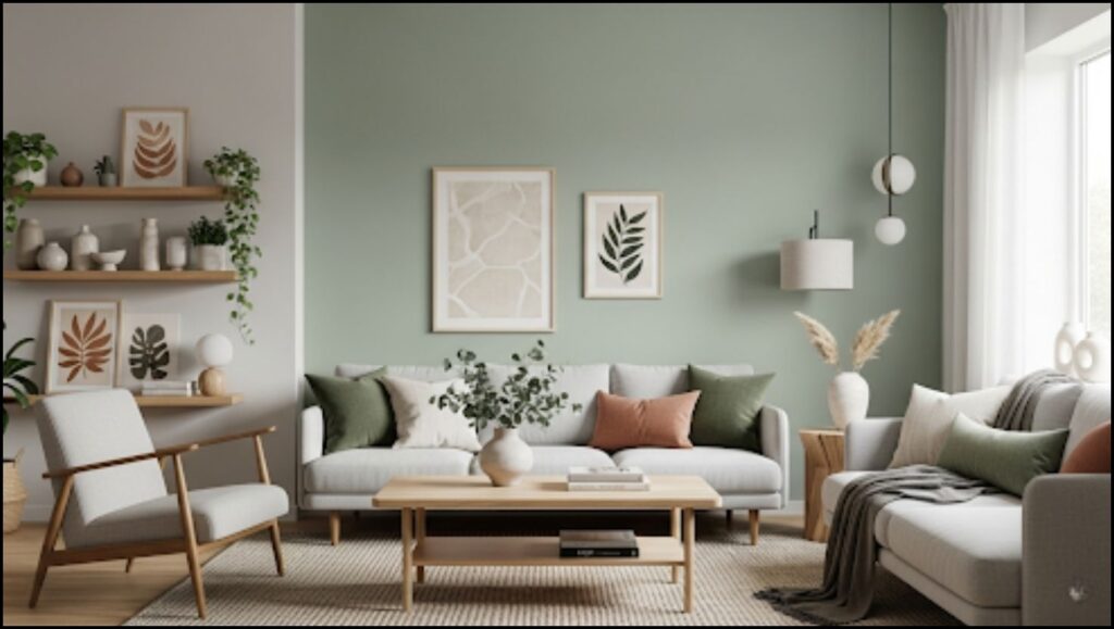
Valspar, a leading paint and coatings company, has announced Warm Eucalyptus as its 2026 Color of the Year. The company’s selection—a serene, nature-inspired green with warm undertones—reflects a global design trend toward creating calming and restorative home environments. The color is intended to help consumers find comfort and a deeper connection to nature within their personal spaces amid a fast-paced world.

The Psychology Behind the Selection
The choice of Valspar’s 2026 Color of the Year, Warm Eucalyptus, is rooted in consumer research and an analysis of emerging social trends. According to a press release from Valspar, the hue was chosen to resonate with a collective desire for “mindful living” and a focus on wellness. The company’s color marketing director, Sue Kim, stated that the color “is more than just a beautiful shade of green, it’s a reflection of the comfort we crave in our homes.” The color’s warm undertones are designed to create a grounded and welcoming mood, while its green essence draws from the restorative power of nature.
The selection aligns with broader principles of color psychology, which experts say can significantly influence human emotion and behavior. Dr. Anya Sharma, a professor of environmental psychology at the University of Cambridge, explained that colors with associations to nature often have a calming effect. “Green is frequently linked to balance, growth, and tranquility,” Sharma said. “In an interior context, these nature-inspired shades can help lower stress levels and foster a sense of security and renewal.”
A Shift Towards Restorative Design
The announcement of Warm Eucalyptus marks a continuation of a larger industry trend that has seen paint manufacturers move toward more calming and natural palettes. This shift contrasts with some of the bolder, more saturated colors that dominated trend cycles in previous years. The company noted that the color channels vintage design palettes, evoking a sense of nostalgia and timelessness that many consumers are seeking.
The increasing demand for restorative spaces is a direct response to modern life, where homes are now expected to serve multiple functions—from offices and schools to social hubs. This multi-functional reality has led to a greater emphasis on creating havens for rest and renewal. As Kim noted, this trend is a move beyond simply using a color for its aesthetic appeal, instead focusing on its ability to contribute to well-being. “This is a color that encourages restoration and resilience,” she said in the official announcement.
The versatility of the new shade is a key part of its appeal. Valspar has highlighted its ability to be used for a variety of projects, from color-drenching an entire room to adding a subtle accent on cabinetry or furniture. A comparable color, Sage Slate, is also available at independent retailers for broader accessibility.
Complementary Palettes and Styling
Valspar has also released a set of recommended coordinating colors to support the use of Warm Eucalyptus. The company suggests pairing the shade with “earthy, supporting colors” to create a cohesive and soothing home environment.
- Degas Blue: A breezy light blue with green and gray undertones, designed to evoke nostalgia and quiet joy.
- Groundbreaking: A deep, cozy brown with gray undertones, inspired by natural materials like wood.
These complementary colors are intended to bridge the natural world from ground to sky, allowing for a seamless flow between different hues in a space. The palette reflects a broader home design trend that blurs the boundaries between indoor and outdoor living, bringing the outside in through color and organic materials. Designers are increasingly using textures like ceramics and wood alongside these paint colors to enhance the natural feel. The new color palette is versatile enough for both interior and exterior use, allowing homeowners to create a uniform aesthetic across their property.
Market Context and Industry Influence
The announcement is part of an annual ritual for the paint and home goods industry, where major brands like Valspar, Behr, and Sherwin-Williams each select a Color of the Year. These selections are often driven by extensive trend forecasting, consumer research, and economic analysis. The chosen colors can influence everything from home decor to fashion and graphic design for the following year.
Historically, these trends have often mirrored the prevailing social and cultural mood. After periods of turbulence or uncertainty, there is often a noticeable pivot toward more comforting and serene colors. The selection of Warm Eucalyptus fits squarely into this pattern, providing a sense of stability and calm. This color choice and the broader trend it represents will be closely watched by interior designers, architects, and home improvement retailers as they plan for the 2026 market.
The paint industry’s influence on consumer choices is significant. A study by the American Psychological Association found that consumers often seek out products and environments that promote a sense of well-being, and color is a primary tool for achieving this. The trend toward mindful, nature-inspired living is expected to continue shaping interior trends for the foreseeable future, suggesting that the era of grounded, comforting colors is likely to persist.
Sherwin-Williams Names ‘Horizon Blue’ as 2026 Color of the Year, Signaling a Shift to Stability
