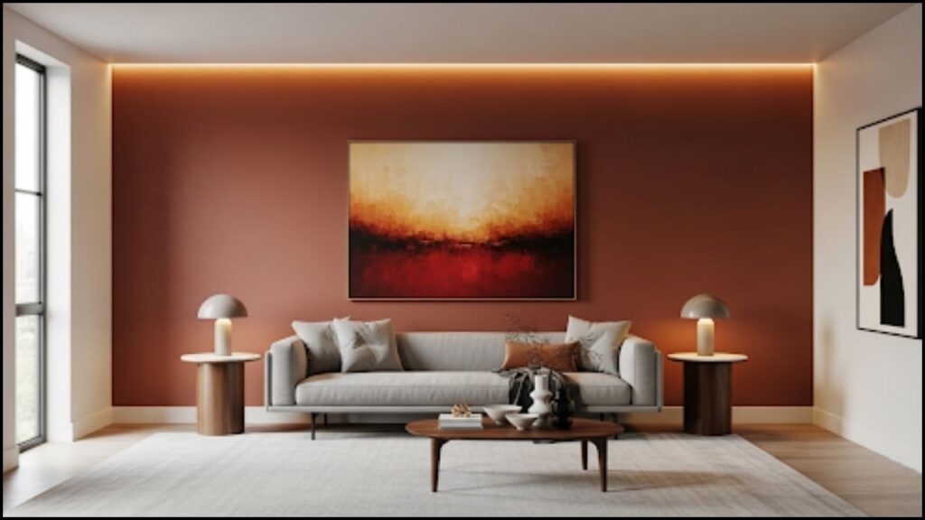
Glidden, a brand of the Pittsburgh Paints Company (PPC), has announced its 2026 Color of the Year, “Warm Mahogany” (PPG1060-7), a deep, timeless red with rich brown undertones. The selection marks a significant turn toward warm, classic tones in interior design, a shift that signals a desire for comfort, nostalgia, and authentic connection in an increasingly digital world. This move away from the cooler grays and blues that have dominated for years reflects a broader cultural pivot toward creating spaces that feel grounded and intimate.

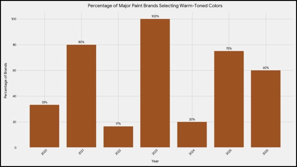
Warm Tones Are Back in 2026
The selection of a deep, earthy red like Warm Mahogany highlights a major trend reversal in the home and design industry. For nearly a decade, minimalist aesthetics and neutral palettes, characterized by shades of gray, white, and cool-toned pastels, have been the prevailing choice for homeowners and designers. These colors often represented a clean, modern look. However, according to experts, the cultural mood has changed. “We are seeing a profound desire for authenticity and personal expression in our homes,” said Ashley McCollum, a Glidden paint color expert, in a recent press release. “Warm Mahogany is a direct response to this. It’s a color that is both bold and reserved, capable of making a timeless statement without succumbing to fleeting trends.”
The color choice is part of a wider movement that many brands are tapping into. Other paint companies, including Behr and Valspar, have also announced their 2026 selections, which, while different, share a common thread of warmth and connection to nature. Behr’s “Hidden Gem,” a smoky jade, and Valspar’s “Warm Eucalyptus,” a grounded green, both lean into organic, restorative palettes. This collective shift suggests a market-wide consensus that consumers are prioritizing spaces that offer refuge and foster well-being.
The Psychology Behind the Color
The strategic selection of Warm Mahogany goes beyond aesthetics. It taps into a growing psychological need for human connection and intentional living. In an era of rapid technological advancement and remote work, the home has evolved from a simple dwelling into a sanctuary for rest and social engagement.

Dr. Eleanor Vance, a professor of environmental psychology at the University of California, Berkeley, noted that color has a powerful impact on mood and behavior. “Warm, saturated colors like red and brown are often associated with comfort, security, and passion,” Dr. Vance explained. “They can stimulate a sense of intimacy and encourage conversation, making them ideal for spaces like dining rooms and dens where people gather.”
Conversely, the minimalist, cooler palettes of the past were often linked to a desire for clean, unadorned spaces. While they can evoke a sense of calm and order, they can also feel clinical or detached. The move to warmer tones is a subconscious effort to fill that void with color that feels more inviting and lived in.
Practical Applications and Versatility
Warm Mahogany is presented not as a restrictive trend but as a highly versatile option for modern homes. Ashley McCollum recommends using the shade to create a dramatic, cohesive feel through “color drenching”—the practice of painting walls, trim, and even ceilings in the same hue. This technique, she says, creates an immersive, cocoon-like effect that enhances the color’s warmth and sophistication.
For those seeking a less dramatic application, the paint also works well as an accent color. “It’s perfect for a kitchen island, built-in bookshelves, or a front door,” McCollum said. The color pairs well with both modern and traditional design elements, complementing matte black or brass hardware, as well as natural materials like wood, stone, and woven textiles. This adaptability, according to Glidden, makes it a “trend for anti-trend seekers,” a color with staying power.
Market Response and Looking Forward
The announcement of Glidden’s 2026 Color of the Year has generated significant discussion within the interior design community. Industry analysts and designers are closely watching how consumer behavior will align with this forecast. The shift to warmer, more saturated colors may indicate a post-pandemic desire for vibrant, comforting spaces that serve as a stark contrast to the period of austerity and uncertainty.
While the market for cool-toned neutrals remains strong, particularly for home resale value, the new forecast suggests a growing consumer confidence to experiment with bolder, more personalized choices. The move toward colors that evoke heritage and timelessness, like Warm Mahogany, indicates a new kind of “quiet luxury” that is less about opulence and more about creating a rich, soulful environment. The final word on Warm Mahogany’s impact on 2026 design trends remains to be seen, but its selection by Glidden marks a clear and decisive step away from the minimalist past and toward a future where comfort, connection, and warmth are at the heart of home design.
